
MAGCD Unit 3 | Writing Submission
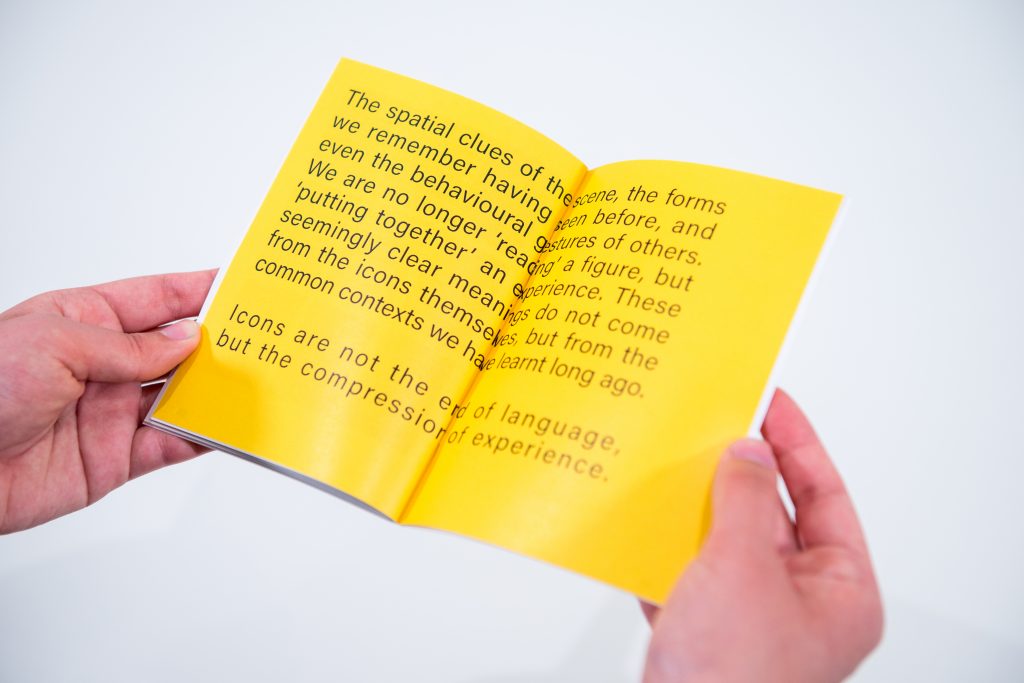
Project Title: Read me again
Name: Lin Zhang
Date: May 21, 2025
Abstract
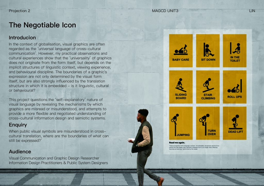
This project raises the question: “Where are the boundaries of meaning when public graphic symbols are misread in cross-cultural contexts?” Starting from everyday sign in public spaces, I explore how meaning is not embedded in graphics themselves, but arises from interactions between icon, text, environment, and cultural experience. My enquiry is grounded in two primary axes: first, How meaning is co-produced when icons and text appear together or in conflict; and second, how legibility breaks down when familiar structures are visually displaced, reconfigured, or left without guidance. Through iterative experiments ranging from syntactic mismatch to semantic recombination, my practice reveals the limitations of ‘generic’ graphic design.
This enquiry is relevant to designers, educators, and researchers concerned with visual literacy, information design, and global signage systems. Rather than pursuing a new visual language, the project investigates what causes misreadings, what enables recognition, and how ambiguity itself can be productive. The result is a publication composed of semiotic interventions and graphic translations, not to answer but to surface the conditions that shape our understanding of visual language.
Context
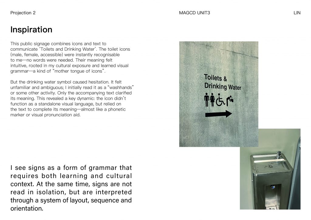
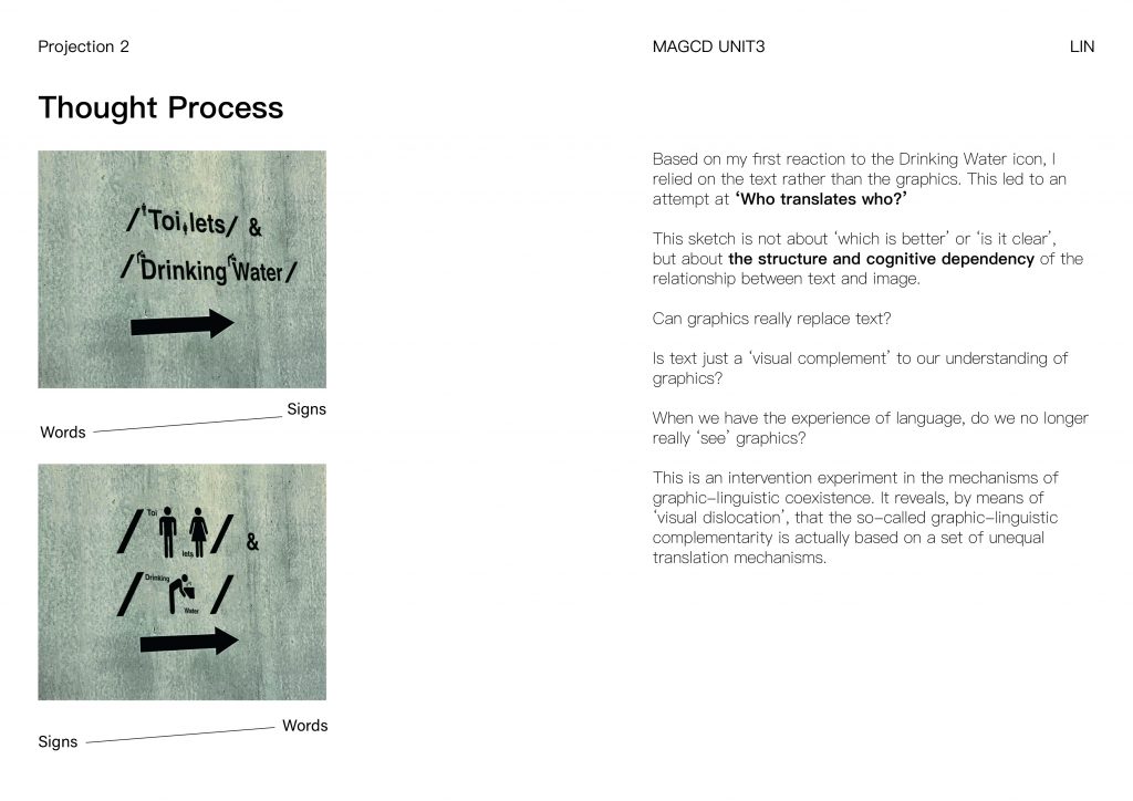
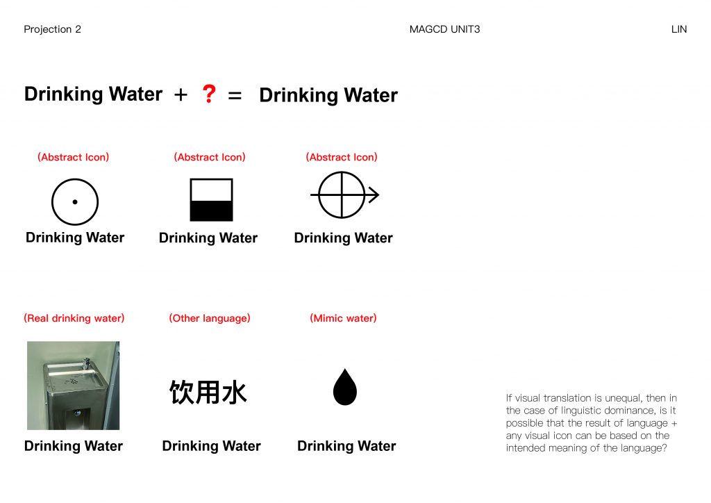
This research stems from my cross-cultural experience: as a Chinese designer, I often encountered visual misunderstandings when using unfamiliar signage systems in the UK. A typical example is a public toilet sign that combines icons for toilets and drinking water. While the toilet symbol was instantly recognisable due to repeated cultural encounters, the drinking water icon was hesitant and was initially mistaken for hand washing. Only the accompanying English words clarify the intent. This momentary delay exposes the critical gap between graphic legibility and semantic certainty as a starting point for the project.
Drawing on Gunther Kress and Theo van Leeuwen’s Reading Images (2006), I see visual communication as a form of grammar that requires both learning and cultural context. At the same time, visual symbols are not read in isolation, but are interpreted through a system of layout, order and orientation. Xu Bing’s Book From the Ground (2014) further inspired the idea that icons can mimic the structure of language – but his work also reveals the fragility of assumed universals.
My project positions icons as visual verbs rather than fixed messages that need to be ‘connected’ through language, instruction or placement. This coincides with Wittgenstein’s theory of language games – every interpretation depends on context. At the same time, Heidegger’s Being and Time(1927) provided guidance in reorganising familiar icons: by moving positions, rotating parts or removing visual anchors, I tested the boundaries of recognition.
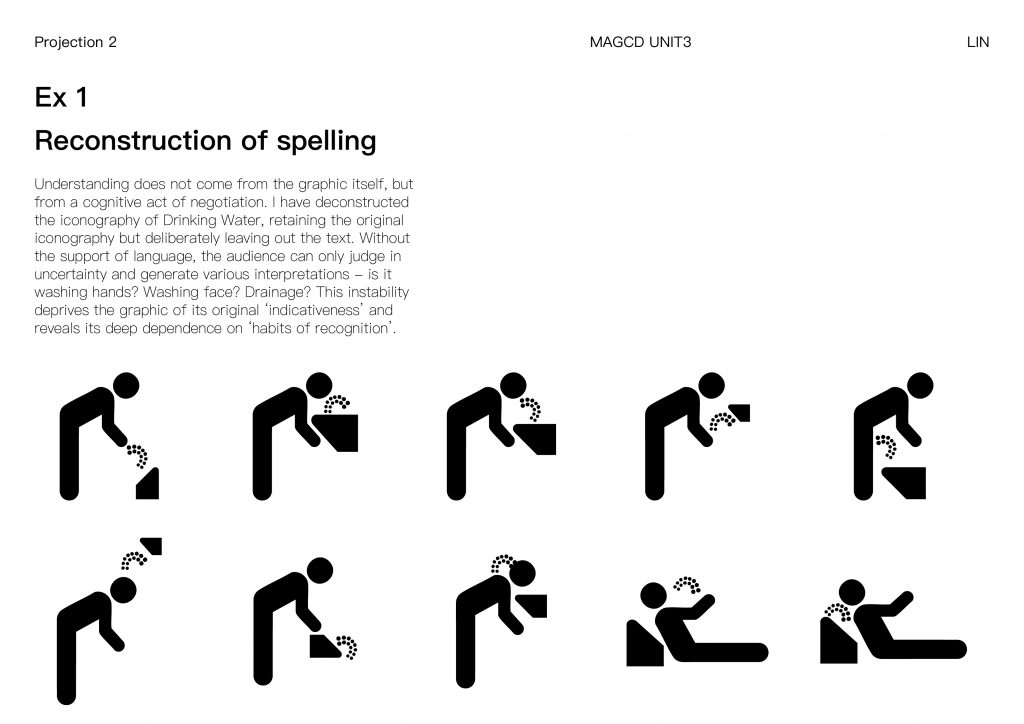
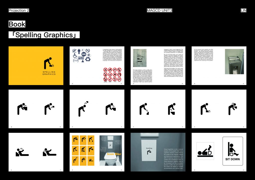
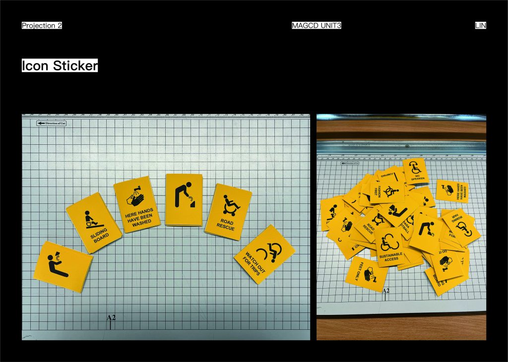
Understanding does not come from the graphic itself, but from an act of cognitive negotiation. I deconstructed the Drinking Water iconography, retaining the original iconography but deliberately leaving out the text. Without the support of language, the viewer can only make judgements in uncertainty and generate various interpretations – is it washing hands? Washing face? Drainage? This instability deprives the graphic of its original ‘indicativeness’ and reveals its deep dependence on ‘recognition habits’.
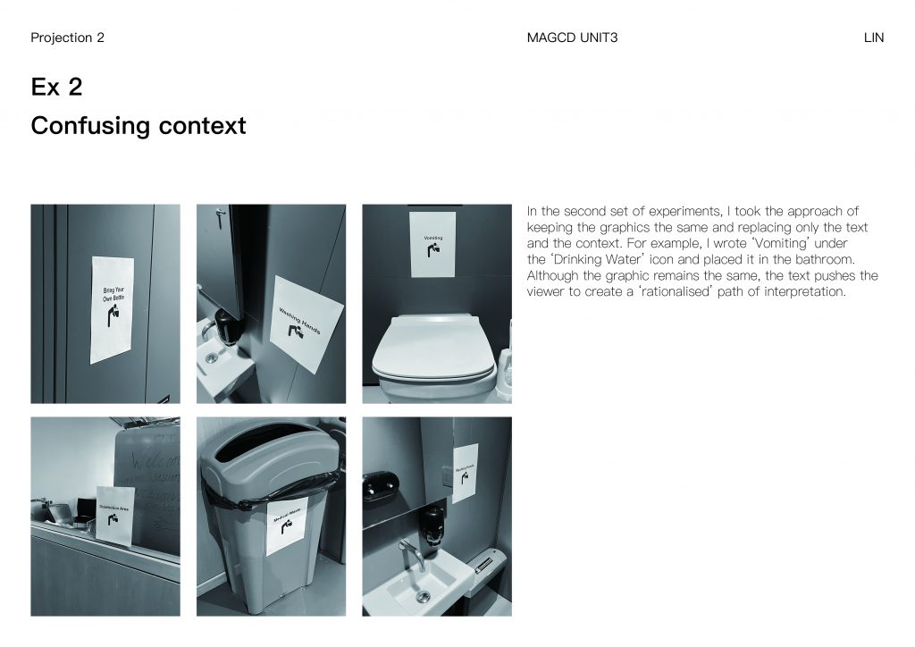
In the second set of experiments, I took the approach of keeping the graphic unchanged and replacing only the text and the context. For example, I wrote ‘Vomiting’ under the ‘Drinking Water’ icon and placed it in the bathroom. While the graphic remains the same, the text pushes the viewer to create ‘rationalised’ interpretative paths.
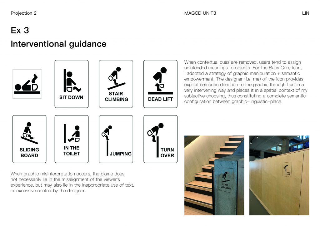
As Uta Brandes and Michael Erlhoff point out in Non-Intentional Design (2006), when contextual cues are removed, users tend to assign unintended meanings to objects. For the Baby Care icon, I adopted the strategy of graphic manipulation + semantic empowerment. The designer (i.e. me) in the icon provides a clear semantic direction for the graphic through the text in a very intervening way and places it in a spatial context that I have subjectively chosen, thus constituting a complete semantic configuration between graphic-linguistic-place. The space is no longer the ‘natural background’ of the graphic, but a semantic amplifier to test whether the meaning of the graphic is reinforced, cancelled out or reversed in different spaces. the Baby Care experiment became another way of responding to my project Enquiry: when graphic misinterpretation occurs, the responsibility does not necessarily lie in the misaligned experience of the viewer, but also in the misaligned experience of the text, which may be the responsibility of the audience. When graphic misinterpretation occurs, the responsibility does not necessarily lie with the viewer’s misplaced experience, but also with the inappropriate use of text or the designer’s over-control.
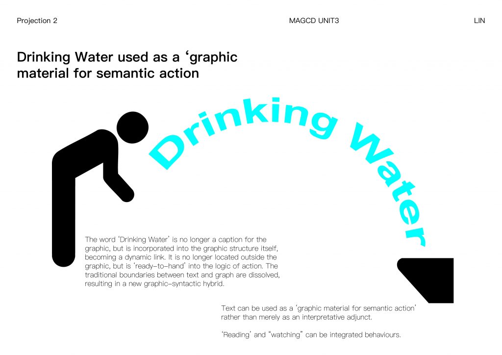
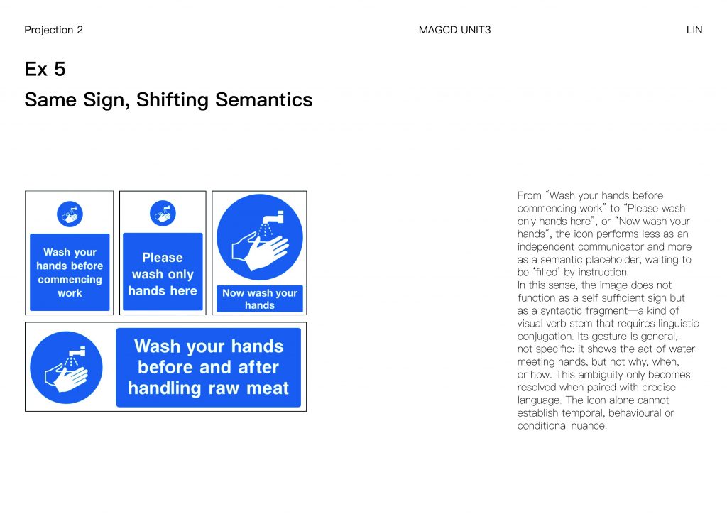
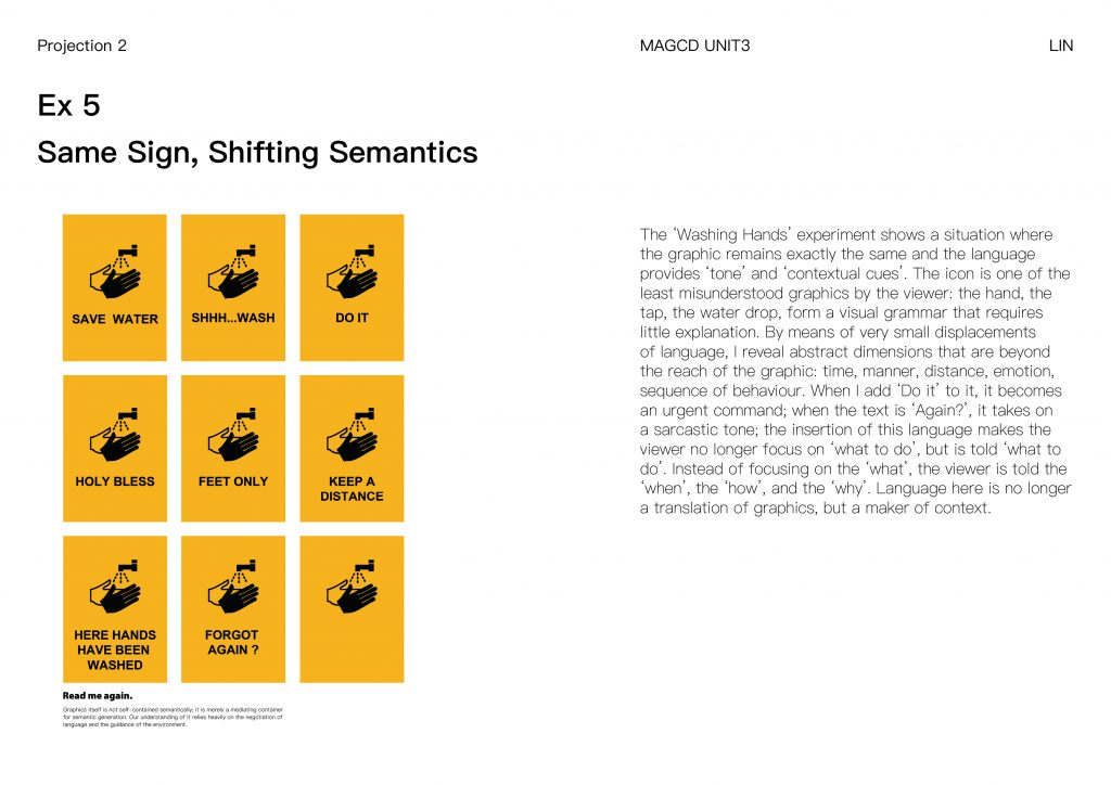
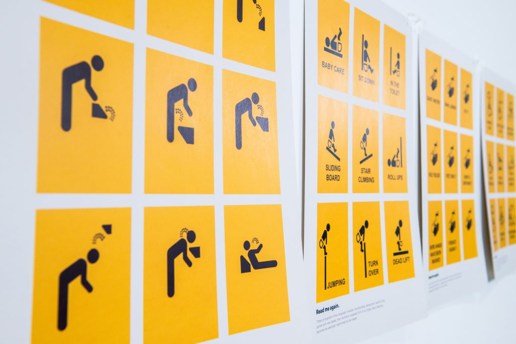
‘The ‘Washing Hands’ experiment shows a situation where the graphic remains exactly the same and the language provides ‘tone’ and ‘contextual cues’. The icon is one of the least misunderstood graphics by the viewer: the hand, the faucet, the water droplet, form a visual grammar that requires little explanation. By means of very small displacements of language, I reveal abstract dimensions that are beyond the reach of the graphic: time, manner, distance, emotion, sequence of behaviour. When I add ‘Now’ to it, it becomes an urgent command; when the text is ‘Again?’, it takes on a sarcastic tone; the insertion of this language makes the viewer no longer focus on the ‘what’, but rather is told ‘what’. Instead of focusing on the ‘what’, the viewer is told the ‘when’, the ‘how’, and the ‘why’. Language here is no longer a translation of the graphic, but a maker of context.
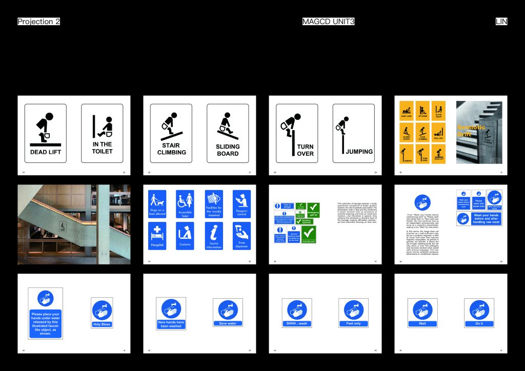
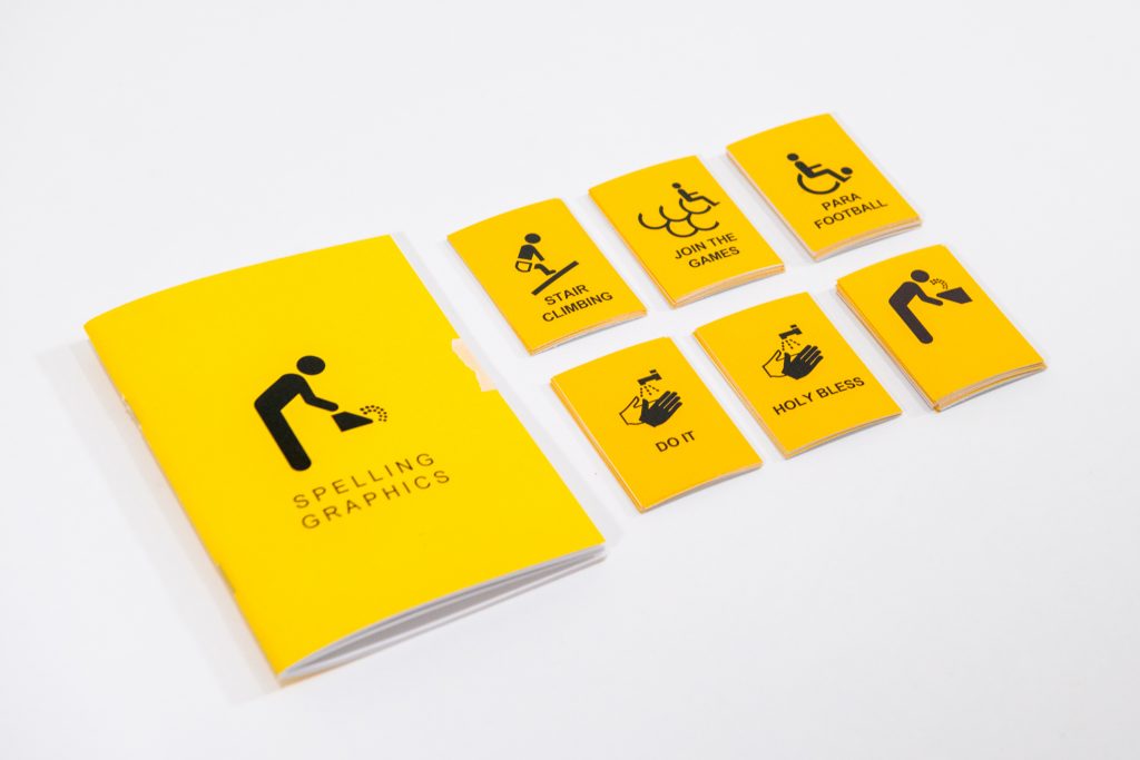
In the extension part of the project, I chose another widely recognised icon, the Accessible symbol, as an experimental object. Unlike the previous graphic treatments, this series does not destructively reconstruct the original icon, but extracts its constituent elements (circle, line, torso, etc.) and locally reorganises, combines, superimposes and semantically mismatches them to activate the potential variability within the graphic on the premise of maintaining its basic structure. While the visual form remains relatively constant, the semantics of the graphic is continuously generated by contextual changes and textual interventions. This part of the practice further responds to the project’s Enquiry: misinterpretation is never a deviation from the original meaning, but rather a result of the negotiation between the designer, the viewer, the context and the cultural experience in the cognitive process. The meaning of a graphic is not closed, it is open, multiple and triggerable.
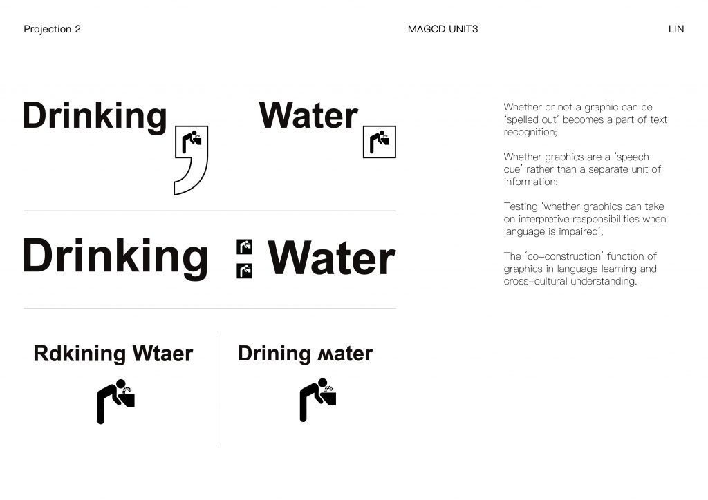
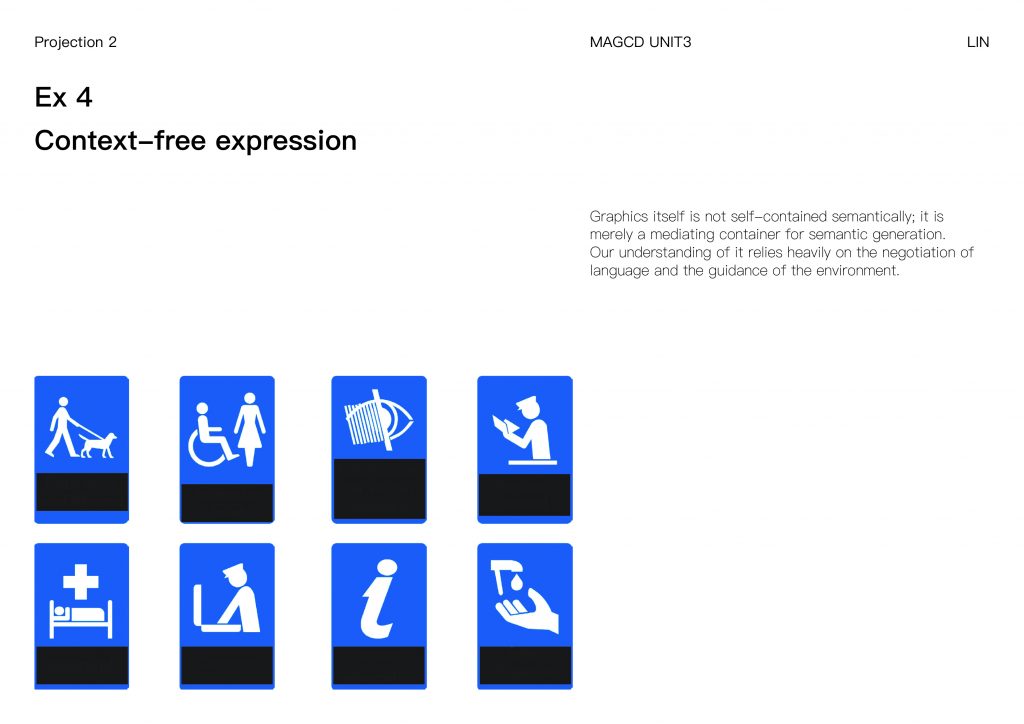
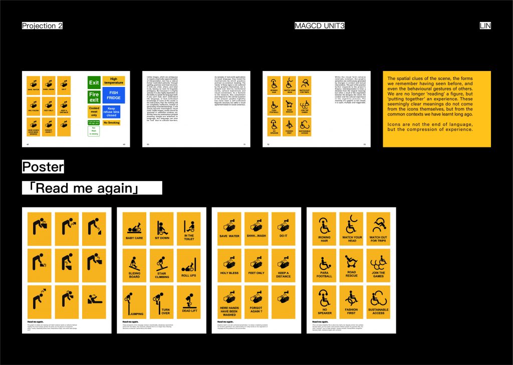
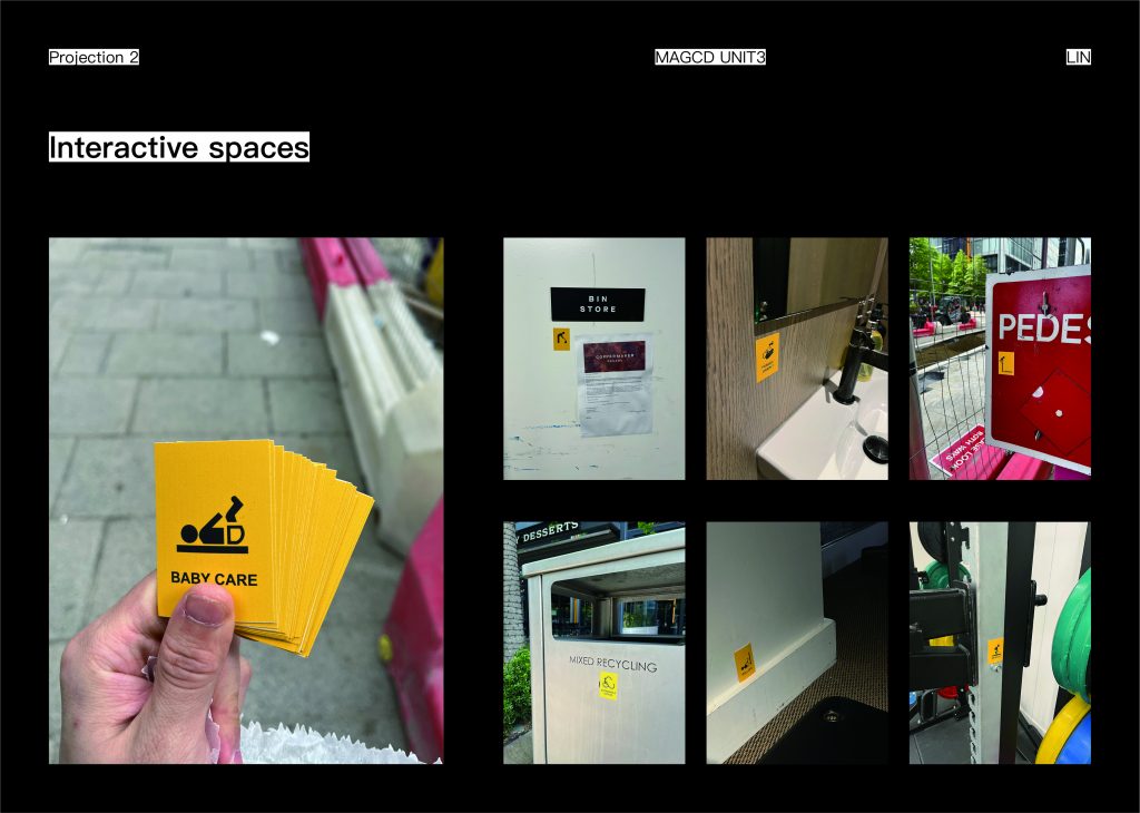
Graphics is not a language, so it does not carry meaning on its own. This is further verified in my collection of images of real public spaces: the graphic components such as exclamation marks, checkmarks, and frames attached to a large number of ‘text-only’ instructions do not explicitly point to a meaning, but rather are more like a tone of voice, an emphasis mark, or a visual accent. These graphics themselves have almost zero ‘communicative power’ when taken out of the text. They rely on language for their meaning, rather than independent expression.
Projected Contribution
This project reframes the way we understand public pictograms—not as generic communication tools, but as conditional protocols constructed through language, space, and habit. In doing so, it challenges fundamental assumptions about information design, especially in multicultural or multilingual environments.
In practice, the project provides a design methodology for analysing, testing, and extending visual identities. It introduces a set of visual strategies—from structural defamiliarisation and textual reframing, to spatial recontextualisation—that can be used to critically test the legibility and adaptability of symbols. These methods can inform future approaches in signage design, particularly in public or cross-cultural settings where clarity, flexibility, and misreading must be accounted for simultaneously.
The project also contributes pedagogically by offering a new lens for teaching visual literacy. Instead of focusing solely on clarity or effectiveness, it opens up space for students and practitioners to explore misunderstanding as a productive site—where ambiguity, mismatch, or contextual misalignment are not failures, but catalysts for deeper engagement with meaning-making processes.
Theoretically, the project contributes to the semiotic discourse by demonstrating that even the most ‘neutral’ icons operate within structures of authority, habit, and interpretation. The research foregrounds the performative nature of pictograms: they do not simply represent, they instruct, guide, and are interpreted differently depending on who reads them, where, and how often.
Finally, the format of the publication Read Me Again acts as a typological and critical tool. It offers not a solution, but a system of reflection—inviting viewers to re-read, re-label, and re-situate what they assume to be ‘self-evident’. The accompanying posters extend the impact of the project beyond the book, acting as standalone provocations that question whether recognition is a matter of design, memory, or context. Together, they present a layered critique of contemporary visual culture, advocating for a more reflexive and negotiated approach to the design of ‘universal’ systems.
Bibliography
1.Kress, G. & van Leeuwen, T. (2006). Reading Images.
2.Xu, Bing. (2014). Book From the Ground: From Point to Point.
3.Heidegger, M. (1927). Being and Time. Harper Perennial.
4.Brandes, U. & Erlhoff, M. (2006). Non Intentional Design.